San Francisco Transit Kiosk Concept
A team of Slalom San Francisco UX designers entered a design competition with a futuristic vision of San Francisco and Bay Area Transit Kiosk. With new high-rise buildings popping up and a brand new Transbay terminal on it's way to completion the transportation infrastructure itself was noticed to be in a dilapidating state. Ticketing kiosk in particular was identified by the design team which could use a fresh design approach to accommodate tourists, accessibility users and everyday commuters for all their public transit needs.
ideation, research and exploration
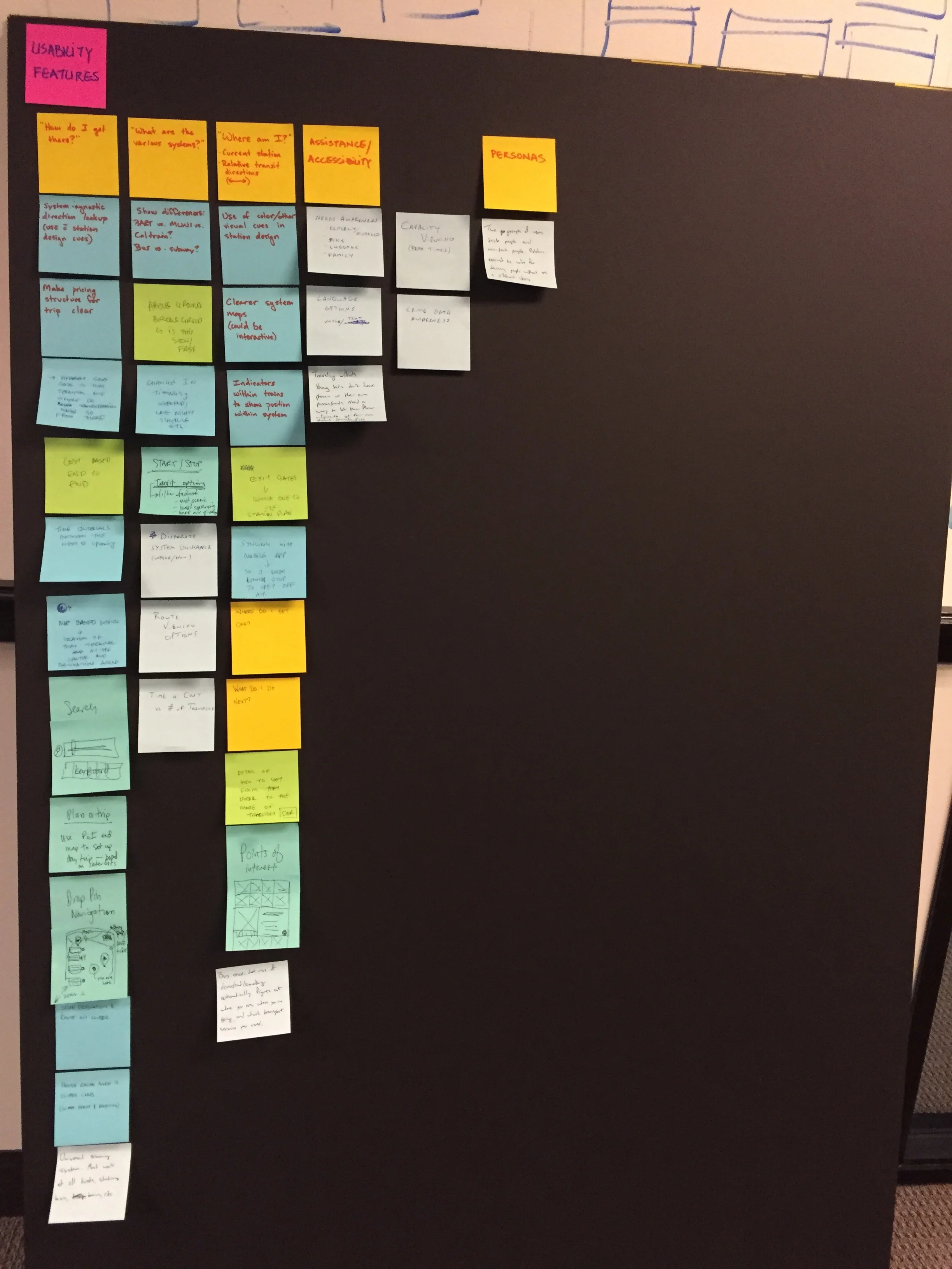
Design team started with a divergent exploration exercise before narrowing down to an idea that excited everyone. After idea selection the design team diverged again to explore different technologies, methods and examples to address design of the kiosk. The team listed all the features, considerations, user types, physical locations, environmental factors and modes of transportation to tackle the complexity of the kiosk. The team decided to leverage transparent display technology to enable a free-standing, approachable from both sides kiosk design.
Screen experience
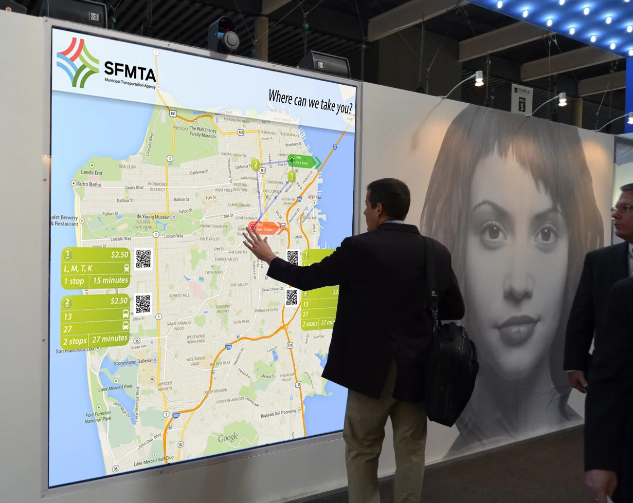
Our team design team focused hard on how to create a simple and easy to choose destination, mode of transport and payment method flow. In 4 easy steps customers could get their tickets and be on their way to catch their upcoming MUNI, Caltrain, BART, Ferry or AC Transit buses.
Kiosk Design
We anticipated our designs to be installed in various scenarios like the bus stops, bus-stations and on the bus.


